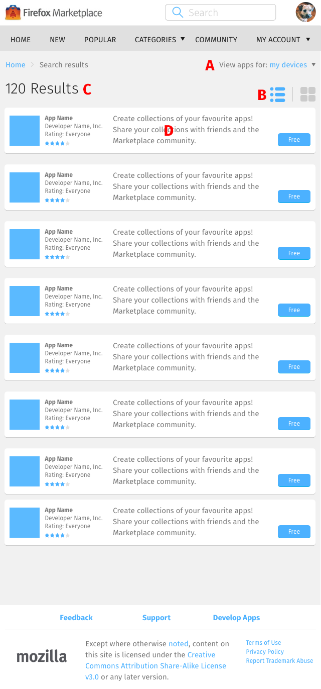
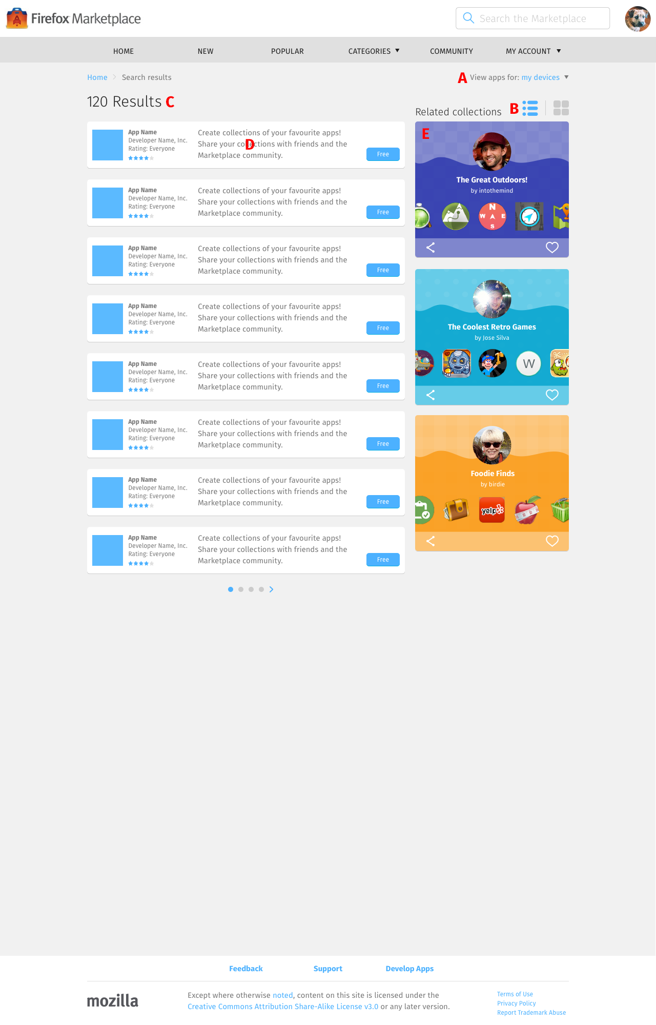
Search Results → Populated, List Layout
Every search result page defaults to using the list layout, unless changed to the gallery layout.


- Device filter dropdown menu: refine search to apps made for a specific screen size.
After selecting an option, the search results page refreshes.
The available options are:- My devices (default option): the screen size that this option selects is eliminated from the list.
- Mobile
- Tablet
- Desktop
- Layout switch: list or gallery layout.
- App listing, each of which contains:
- First column: App icon
- Second column: App name, Developer name, Rating, Star rating
- Third column: App description (limited to display how many characters?)
- Fourth column: Download/buy button
Mobile and Tablet
App listing: displays unlimited rows of app listing, loading new ones on scrolldown.
Desktop
- App listing: displays 8 search results at a time.
- Related collections: 3 collections.
- Navigation: select the left/right arrow, or use the dots to display the next/previous 8 search results.