App Details → Page
- Navigation
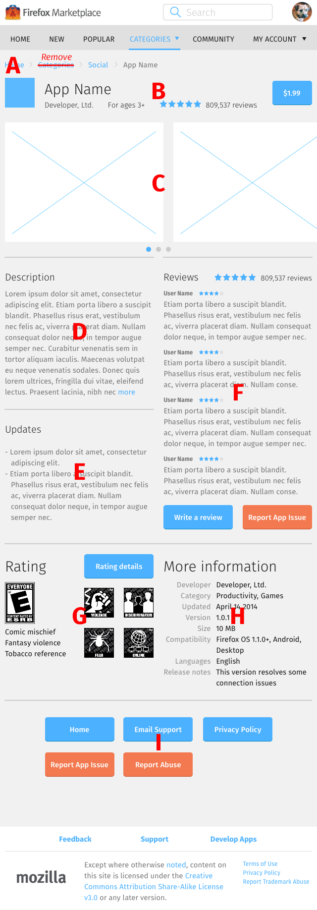
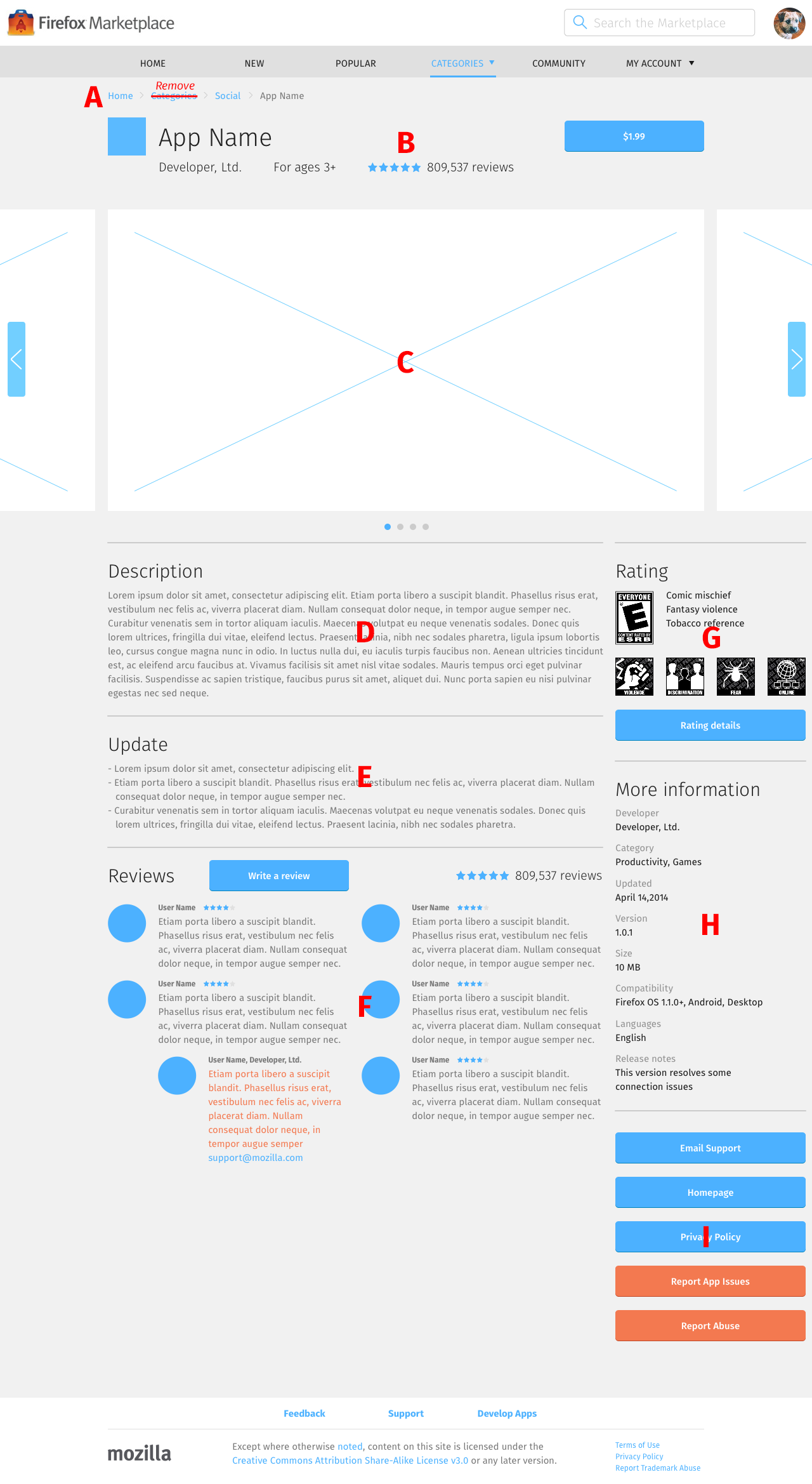
- App information, which contains:
- Icon
- Name
- Developer name
- Short, one-sentence content ratings
- Average review star ratings
- Total number of reviews
- Price button
- Screenshots
There should be a rule as to how screenshots are arranged (what’s the image ordering scheme) and displayed (landscape, portrait, mixed; different devices; etc.)? Currently, it doesn’t exist.
- Directional arrow appears when there are more screenshots than those that can fit inside the space. Use the arrow – or swipe – to navigate through the screenshot carousel.
- Every tap/click of the directional arrow scrolls to the next screenshot in queue.
- Description
- Updates
Appears below description in all layouts.
- Reviews, which contains:
- Rating, which contains:
- Ratings image
- Auxiliary descriptions
- Auxiliary images
- More information, which contains:
- Developer name
- Category(s)
- Date of last update
- Version
- Compatibility
- Languages
- Release notes
- Tools, which contains:
- Email Support: provided by the developer when the app was submitted.
- Homepage: also provided on app submission.
- Privacy Policy: opens the privacy policy page.
- Report App Issue: opens the report app issue interface.
- Report Abuse: opens the report abuse interface.
Mobile

- Navigation
Has a back arrow that leads to the previous page when selected.
- Reviews
Contains 2 reviews.
Tablet

- Navigation
Contains breadcrumb navigation links that leads to the parent pages when selected. Breadcrumb is always presented in this order:
- Home: leads to Home – The Feed.
- Categories: there is no landing page for all categories, so this item should be removed from the breadcrumb.
- Category name: leads to the list view of apps in a specific category.
- App name
- Description
Appears below screenshots, on the left column
- Reviews
Contains 4 reviews.
Desktop

- Navigation
Like the Tablet layout, contains breadcrumb navigation links that leads to the parent pages when selected. Breadcrumb has the same order as the Tablet layout.
- Description
Appears below screenshots, on the left column
- Reviews
- Contains 6 reviews, divided over 2 columns, with 3 reviews in each column
- Each review has an avatar
- Rating
Ratings image is located to the left of auxiliary descriptions. Auxiliary images are located below them.


