Buttons
Button Sizes
Free Submit Edit
Learn more
Edit
Learn more
There are 4 types of buttons sizes: tiny (24px high), small (36px high), medium (48px high), and large (60px high). Each size has a specific use: tiny is used for the purchase button on mobile devices. small and medium are used for everything else on mobile/tablet/desktop. large is reserved for CTAs or marketing purposes.
Button States
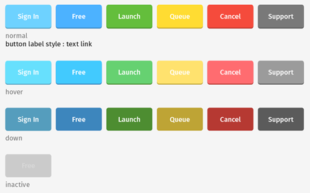
While buttons have an explicit height, they can vary in width. The ideal width of a button is 10px of padding to the left and right of the button's copy. Buttons have a 2px drop shadow. The shadow color is the dark secondary of the button's main color. Unless it is one of the buttons mentioned above, all controls are "action blue".
Extra Buttons
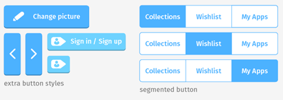
Some buttons use icons instead of or with text for simplicity/clarity. The same spacing rules mentioned above apply: 10px of padding. The segmented control is currently mobile only.
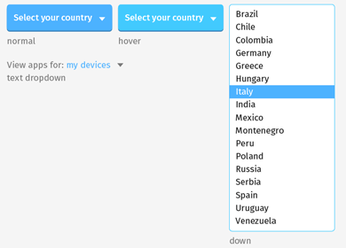
Dropdowns
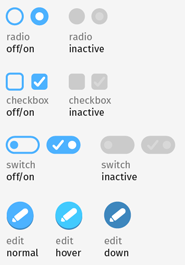
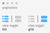
Controls
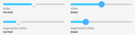
Sliders
Collection Block View All
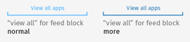
This control appears at the bottom of editorial collection blocks. Tapping/clicking it takes you to a collection detail page.
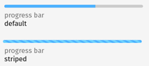
Progress Bars