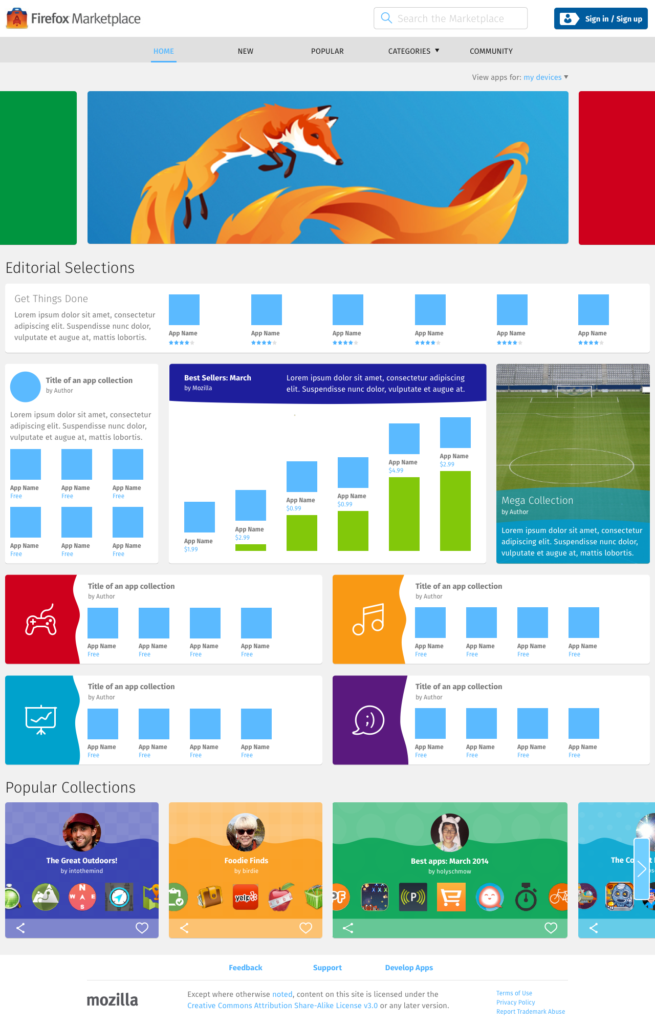
Home – The Feed
The home page on every platform is The Feed: a dynamic list of apps content created by the Marketplace Editorial Staff using the available feed unit types.
If the user is on a partner cell network, the top unit in the display is always going to be the partner's Operator Shelf unit.
As the screen space grows from 4 columns (mobile), to 8 columns (tablet), and to 12+ columns (desktop), the content of the feed stays consistent, but its display changes significantly.
Mobile

- The feed displays as a vertical scrolling list.
- All feed unit is 4 columns wide.
- Each row may contain only 1 feed unit.
Tablet

- The feed displays as a vertical scrolling list, but in certain parts, it’s possible to use the directional arrows to navigate left and right through the carousel of feed units.
- A feed unit can be:
- 4 columns wide
- 8 columns wide
- Each row may contain either 1 or 2 feed units.
Desktop

- Like the tablet layout, it’s possible to use the directional arrows in certain parts of the feed to navigate left and right.
- A feed unit can be:
- 4 columns wide
- 6 columns wide
- 8 columns wide
- 12 columns wide
- 16 columns wide
- Unlike the tablet or mobile layouts, the number of feed units on each row varies depending on the width of the window.
- For instance, on a screen that’s 1280 pixel wide, the layout will contain 16 columns. Therefore, each row may contain:
- 4 units at 4 columns each = 16 columns
- 2 units at 8 columns each = 16 columns
- 1 unit at 8 columns, plus 2 units at 4 columns each = 16 columns
- 2 units at 4 columns each, plus 1 unit at 6 column, plus overflow space worth 2 columns on one side = 16 columns
- 1 unit at 12 columns, plus overflow space worth 4 columns on either side = 16 columns
- 1 unit at 16 columns.