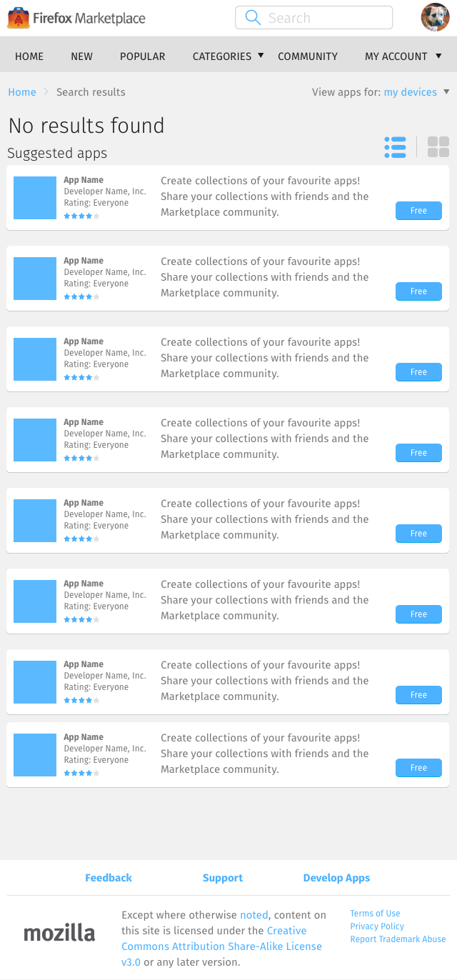
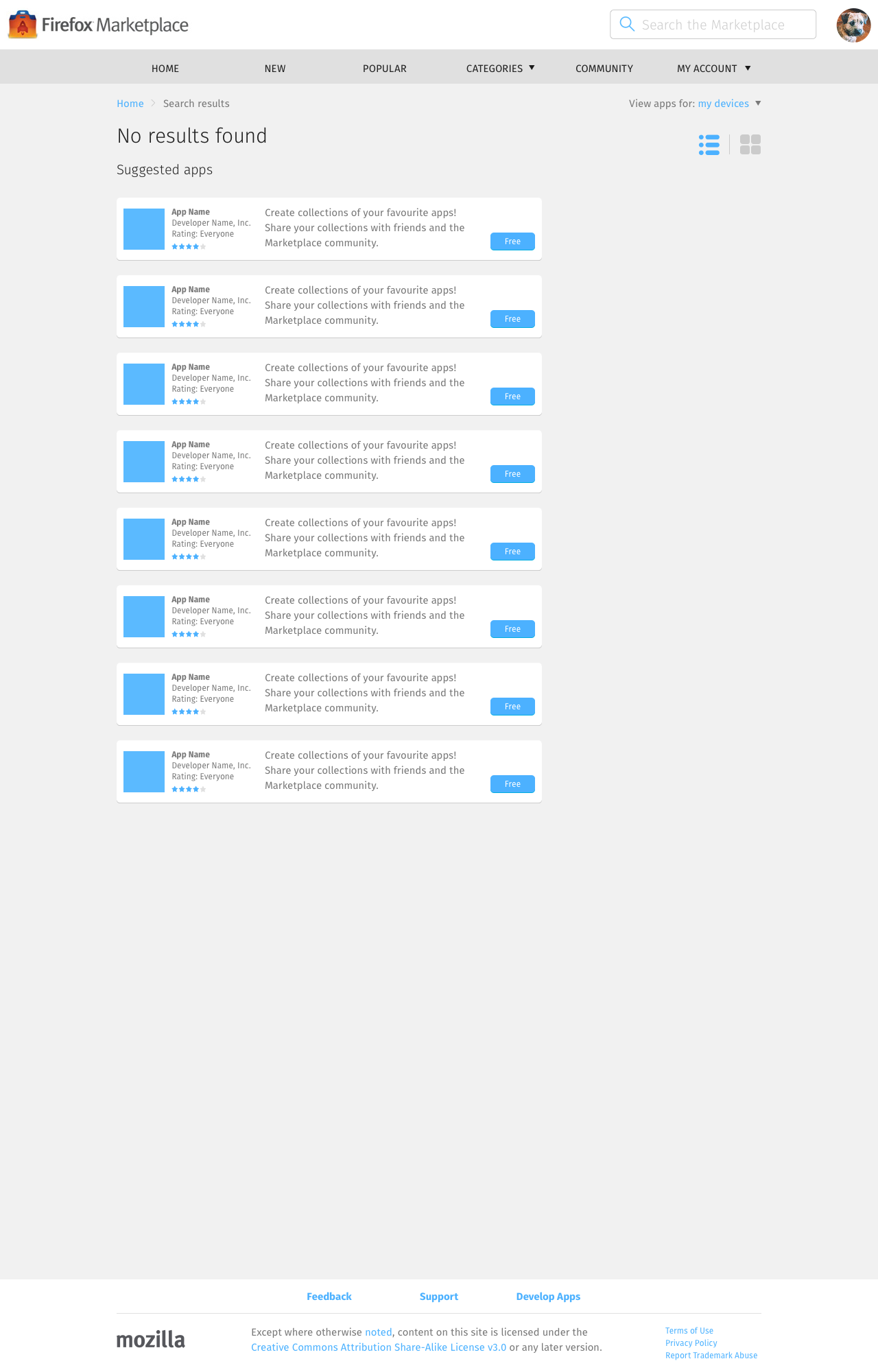
Search Results → Empty


When the search interface – designed to minimise errors – failed to produce a search query, the empty results page should:
- Say “No results found”.
- On the Keyboard layout, automatically focus on the search bar so user can start typing straight away. On Mobile and Tablet layouts, highlighting the bar will pop open the keyboard, stealing away space, so it’s less ideal to do this.
- Display 8 suggested apps that have good association scores when compared against the search query, instead of 8 random apps, 8 popular apps, or 8 new apps.
Rather than relying on user to input good keywords, we should instead design a good search interface. Doing so will minimise the appearance of this zero-result page.