Forms
Text Input
normal
padding: 0px 10px;
background-color: #fff;
border: 1px solid #cbcbcb;
border-radius: 5px;
height: 40px;
width: 300px;
font-family: 'Fira Sans OT';
font-weight: normal;
font-size: 20px;
active/focus
border-color: #4cb1ff;
error
border-color: #f54b3c
color: #b63932;
disabled
background-color: #f1f1f1;
border: 1px solid #cbcbcb;
Labels
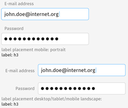
Text labels are to the left of the form field, unless viewed in mobile portrait. Then the label is placed above the field, aligned left.
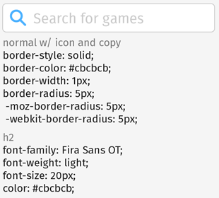
Form fields with icons and text use the same 10px padding rules as buttons with icons and text.
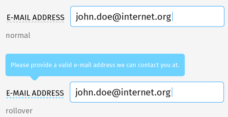
Tooltips appear over dotted-line links.